
NASCLEAR
Visual Identity/Packaging:
NasClear
Design Problem
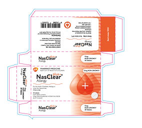
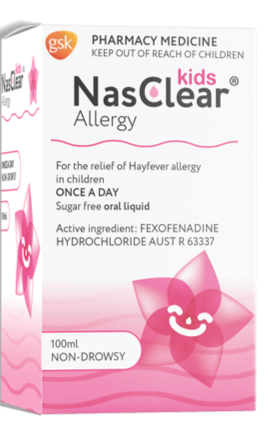
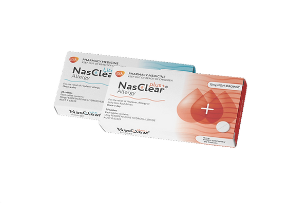
For this project I was tasked to create a logo as well as design the packaging for a hay fever medication. The brief required three different versions, a Lite, Plus+ and Kids, and each should be unique from one another whilst still cohesive.
My Approach
Designed the logo and incorporated a subtle wave effect within the type to represent the wind that carries pollen but also to symbolise "clearing", a common cause for allergies, and using colour and hierarchy to stack and create an effective and clean logo for NasClear.
On the packaging used the same repetition of the wave symbolism as a soft background, as well as a water drop to resemble a runny nose. Throughout each version there's changes in the graphics and colours to match the chosen name and purpose, with lite being simple and clean, plus+ having more energy and 3 times the drop graphics, and kids having a fun pink and a flower using the same drop graphic in it.


Previous Project
Next Project